How this site was made
This site, made the way the projects in it were made: a page with three links became a home and one case study per project, each told in the same six parts, the conclusion first.
In short
- Problem
- pastorello.info was one page: my name, the word “Developer”, a logo and three links. My projects lived only in their repositories. Its heuristic evaluation found the worst severity, 4: the one task a reader comes for, finding how I worked on a project, could not be done.
- Decision
- The conclusion first. One long case study per project, in six fixed parts, with “In short” at its head: structure A of five, with one block taken from B. Direction “Sera” of three: a dark ground, Fraunces and Atkinson Hyperlegible, amber for links only.
- Result
- Measured on the build of 13 October 2026, seven pages: Lighthouse 100 on all four scores at 1280, and 99 or 100 at 360; axe at zero violations at 390 and 1280. No tracking, no cookies, no third-party request.
At a glance
- For
- Me: a place of my own for what I make and how; whoever is hiring reads it as a guest
- What changed
- From a page with three links to a home and one case study per project, each in the same six parts
- My part
- The brief, the evaluation, the wireframes and the visual directions, the copy and the specification, written with Claude; Claude Code built from those documents, and I reviewed every pull request
- Stack
-
- Astro
- TypeScript
- CSS
- GitHub Actions
MDX · Playwright · axe-core · Lighthouse
- When
- September–November 2026 · the brief on 11 September, the build from 24 September
- Links
-
- Repo


Context
Until September 2026, pastorello.info was a single page: my name, the word “Developer”, a round logo and three links, to LinkedIn, GitHub and Stack Overflow. My projects lived only in their repositories. I wanted a place of my own, where I tell in the first person what I make for myself and for the people around me, and how each thing was made.
Problem
On 11 September I evaluated the old site against Nielsen’s ten heuristics, on a desktop at 1280 and on a phone at 375: seven findings. The task the brief sets, find how I worked on a project, could not be done, because there was no project to find: no case study, no work, only three links out.


Exploration
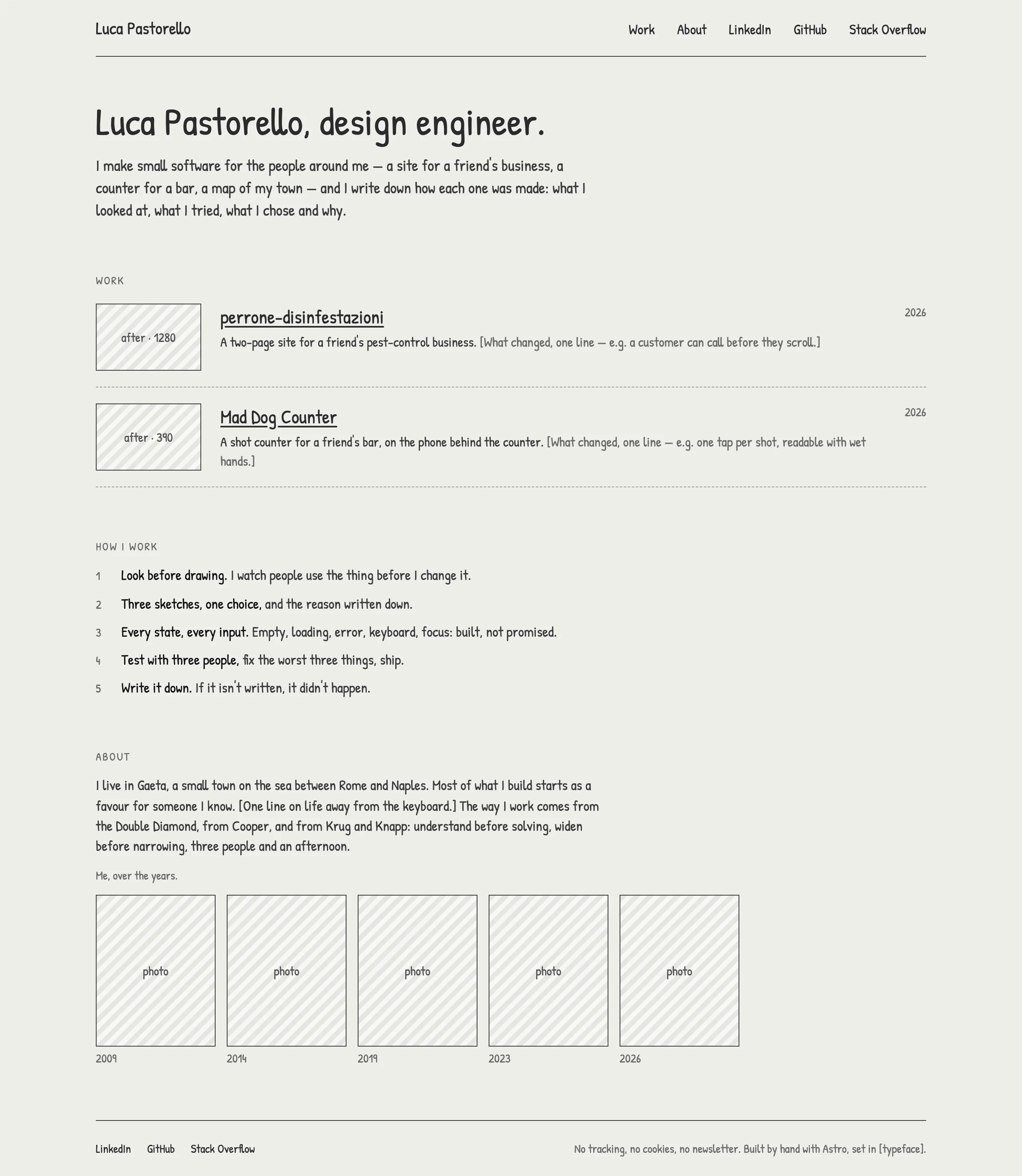
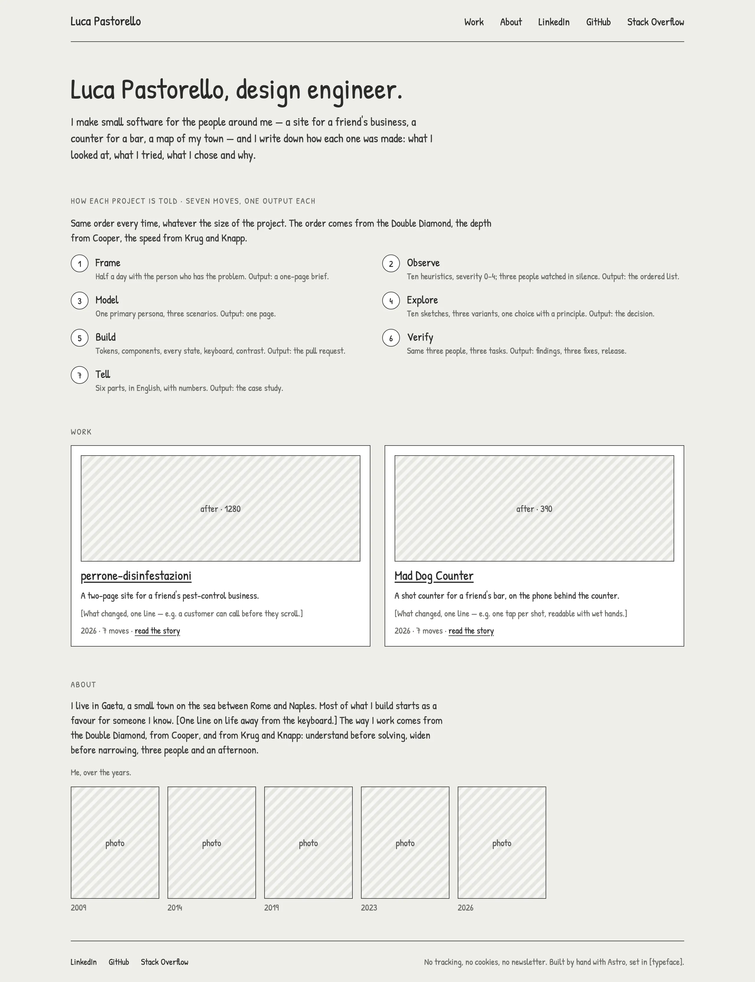
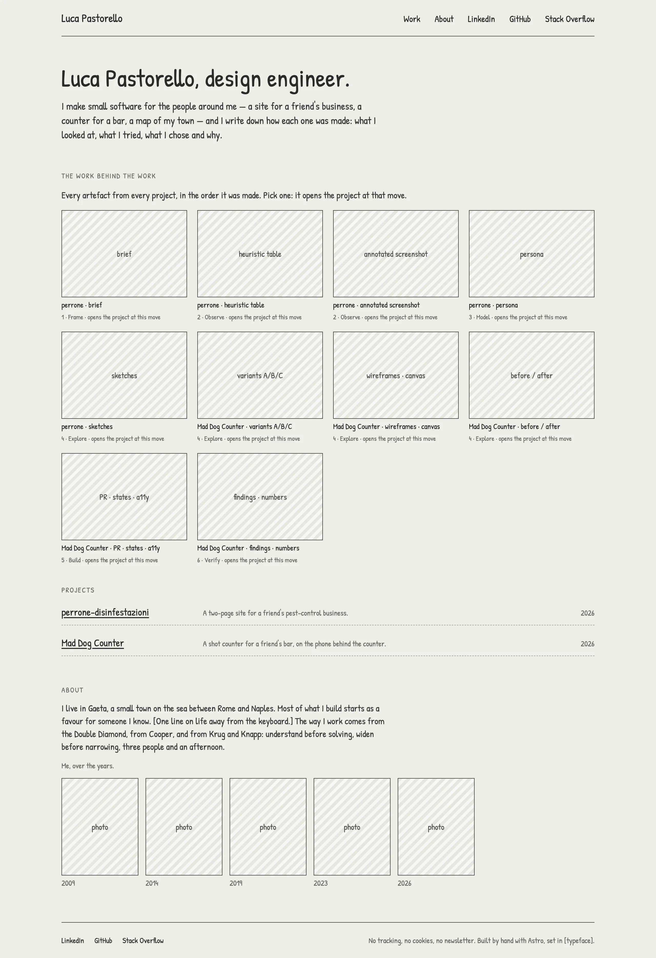
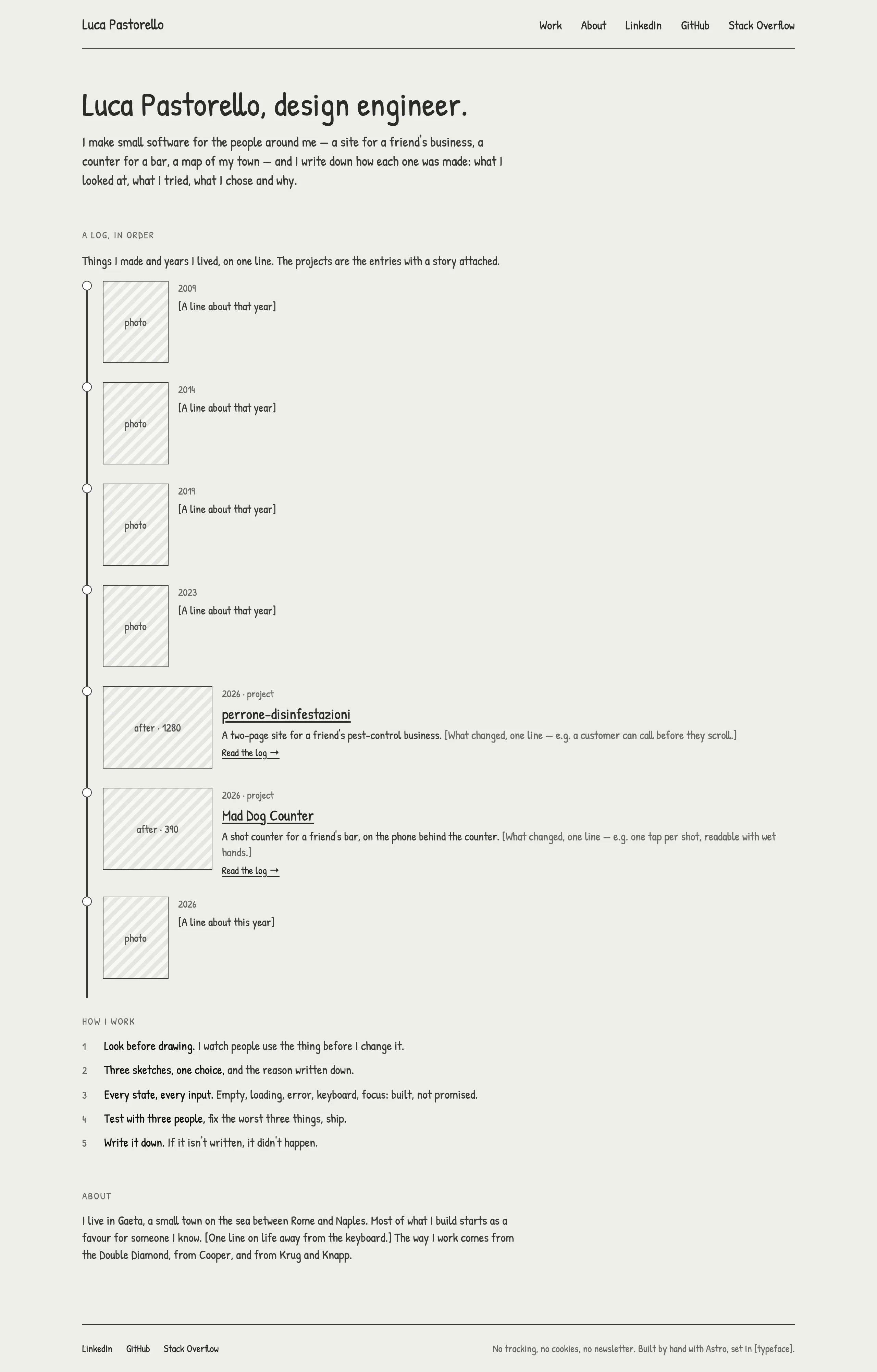
I read nine reference sites first. Then five structures, drawn as wireframes on one canvas with the same content, each a home and a card at 1280 and at 390; only the axis of organisation changed.
-
A · The story Chosen
One long case study in six parts, with a sticky Contents
- for
- Reads like a story; the method shows without being shown off; one document, with no hidden states for a keyboard or a screen reader
- against
- A long page; whoever does not read it does not see the method
-
B · The method up front
“In short”, then the seven moves as a stepper, one at a time
- for
- The method is the first thing seen; “In short” serves the reader with sixty seconds
- against
- Seven clicks to read it all; tabs mean more states and more ARIA; the tone of a checklist, and a name the method does not have; at 390, a long accordion
-
C · The artefacts
The home as a wall of every project’s artefacts; a card in two columns, the text beside a sticky board
- for
- The design material leads; how much work is behind it shows at a glance
- against
- The artefacts before the decisions; at 390 the board becomes a strip; the wall crowds the home
-
D · The diary
Time as the order: one line of years on the home, a day-by-day log on the card
- for
- Honest and personal; the method as a habit, with its real times
- against
- The result is at the bottom; the dates expose the gaps; at 390 the line of time disappears
-
E · One page
The whole site on one page; each project a block, closed or open in place
- for
- No navigation; the quickest to build and to keep; one address
- against
- The page grows with the projects; open and closed states to manage; a card has no page of its own to share or to index
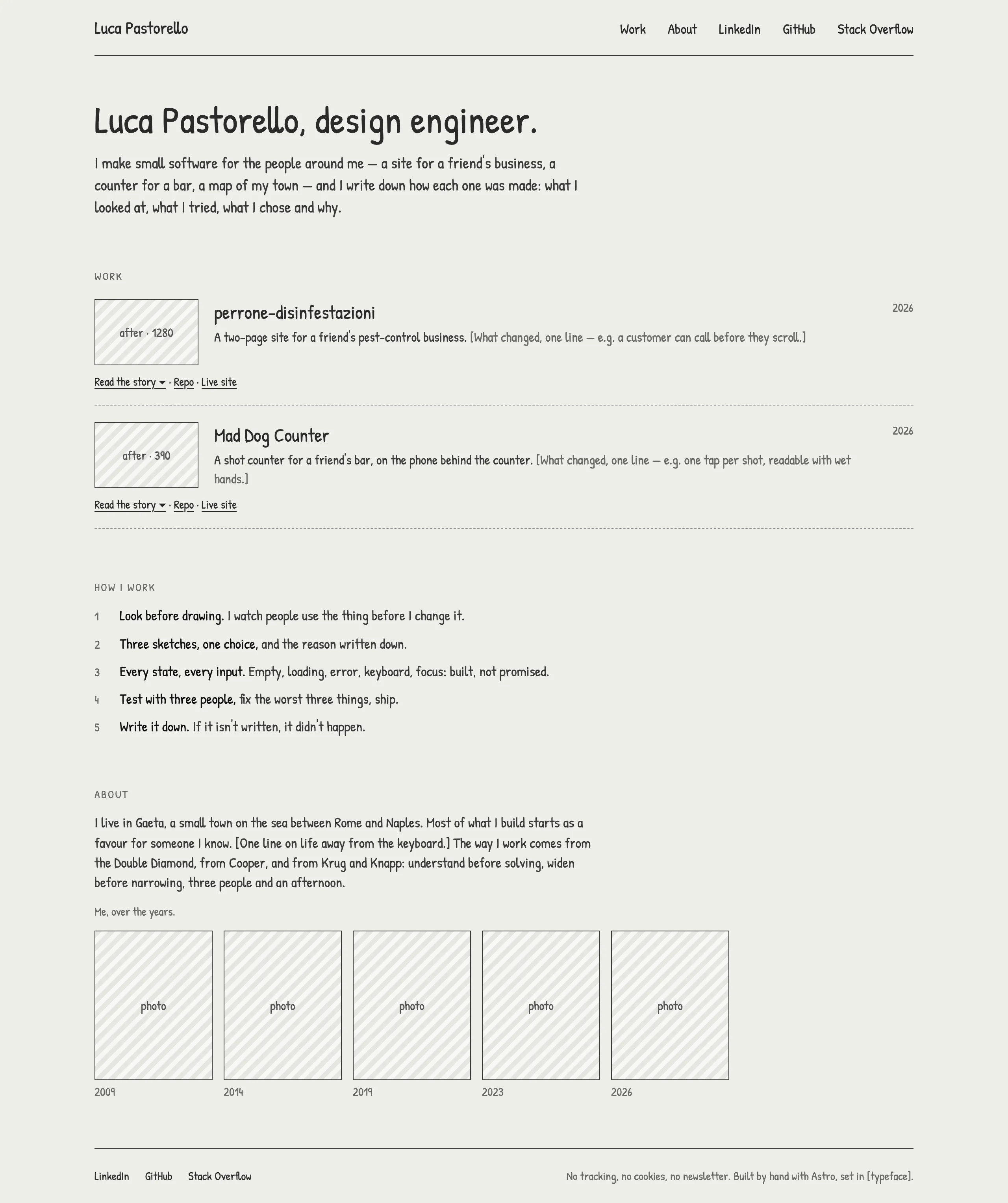
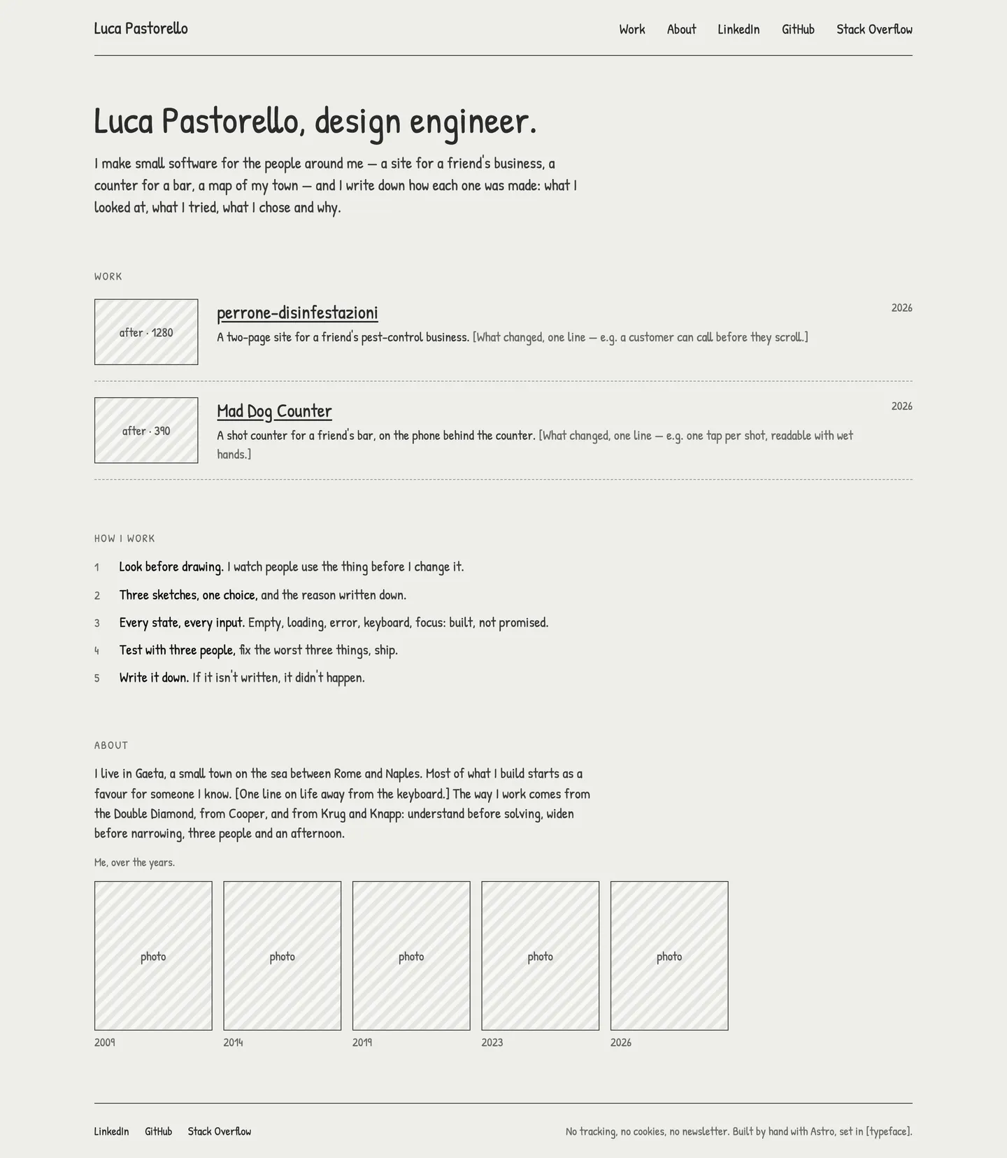
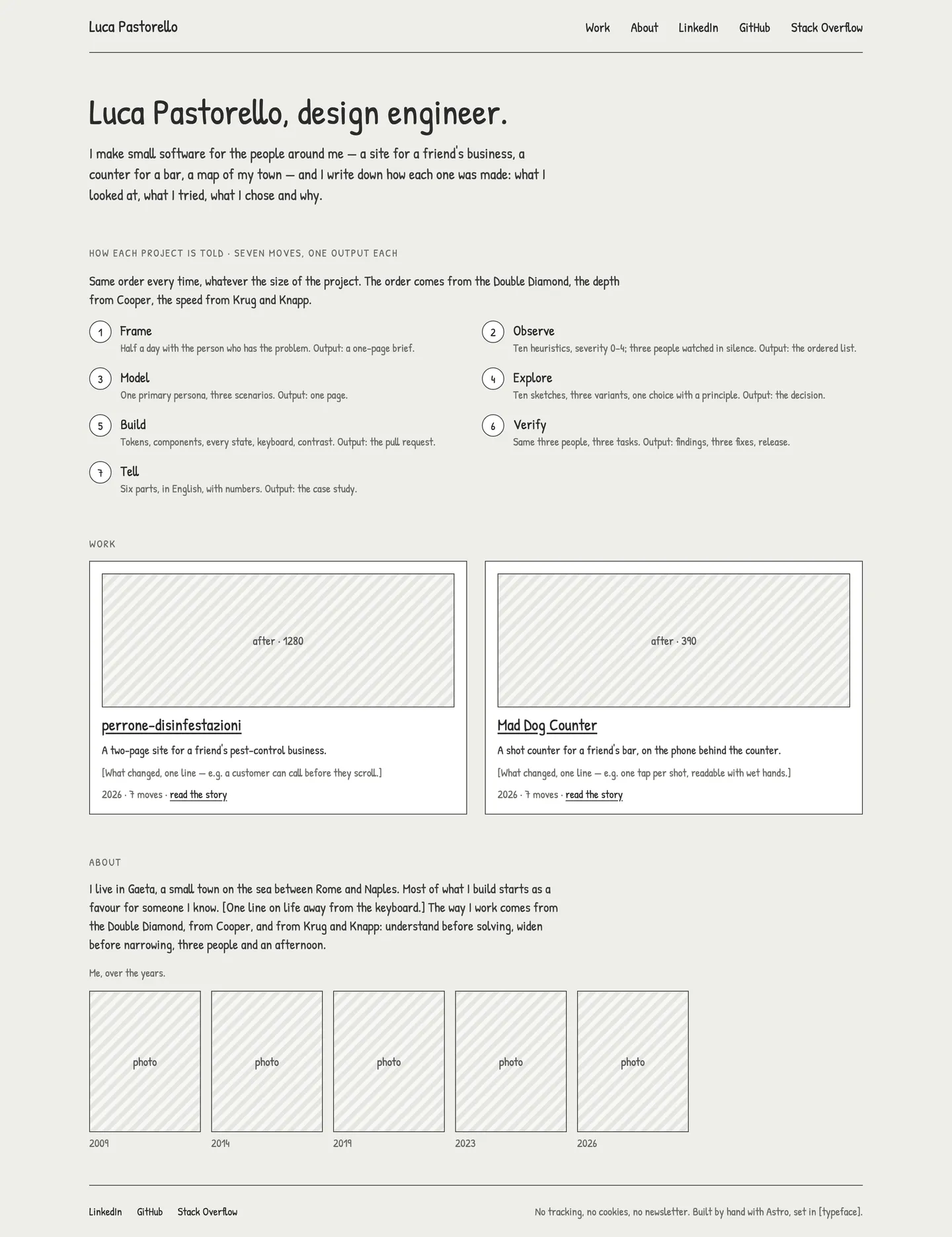
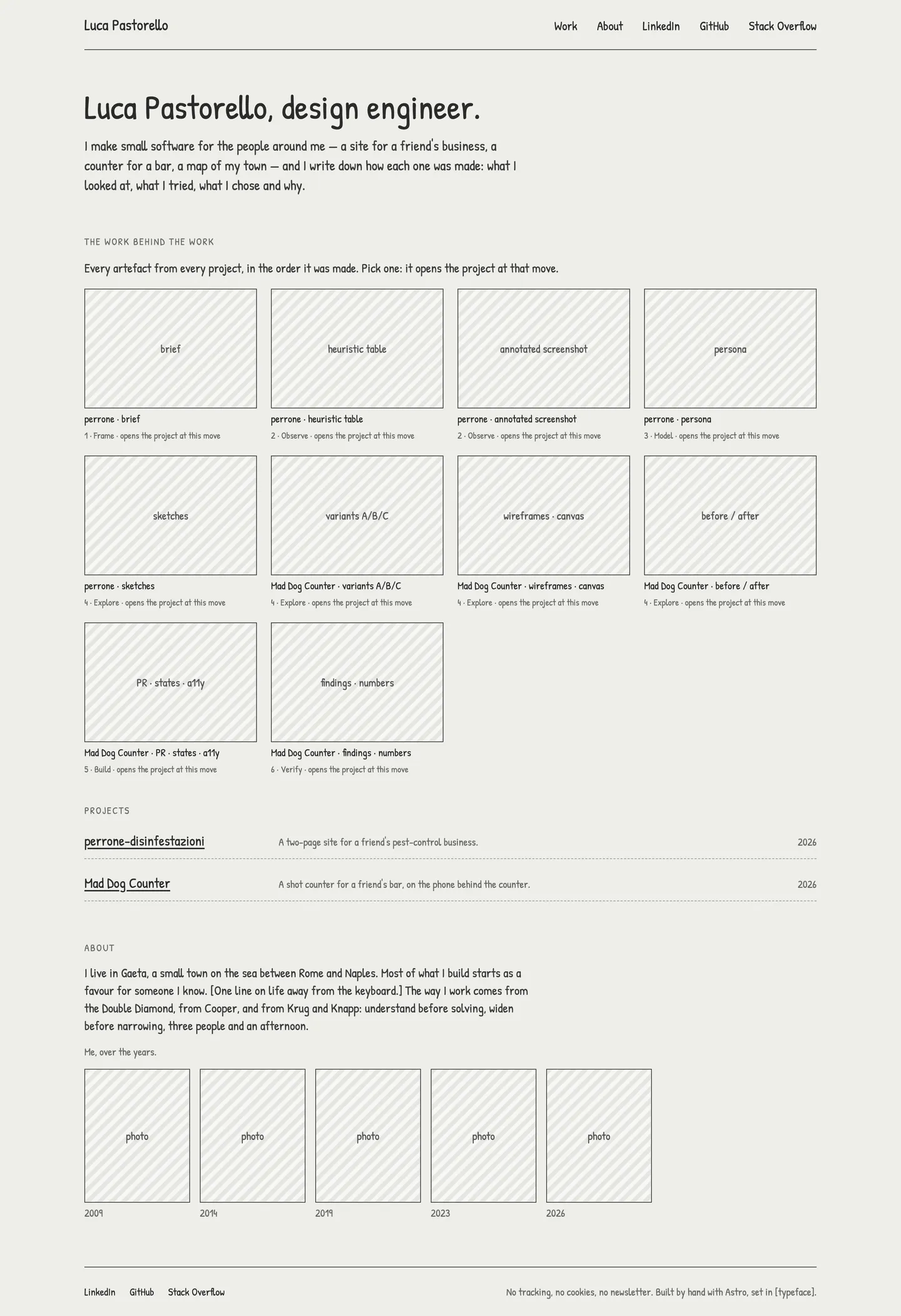
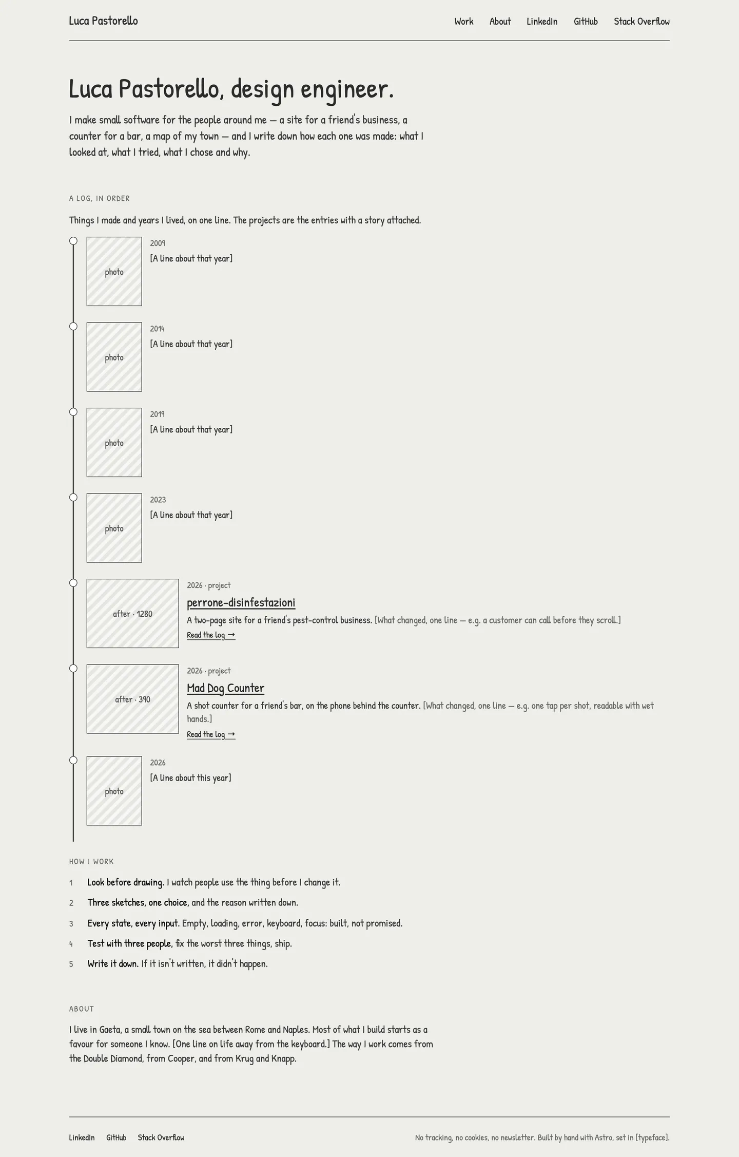
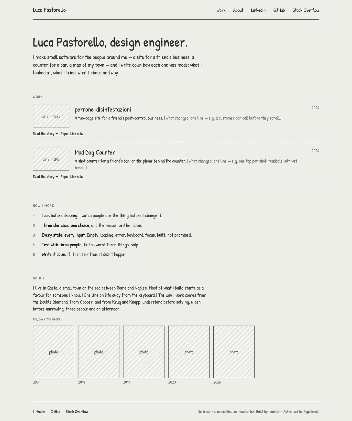
I chose A, with “In short” taken from B: the conclusion first, then the story. B took seven clicks to read a card; C put the artefacts before the decisions; D left the result at the bottom; E gave a card no page to link from a CV.
wireframes/ · decision.md Then three visual directions on that one structure, where only the type and the colours changed.
-
Carta
Newsreader, with IBM Plex Mono for labels and numbers, on warm paper; a brick accent
- against
- Reads literary rather than technical

-
Officina
Schibsted Grotesk and IBM Plex Sans, IBM Plex Mono for labels and numbers, on cool white; a cobalt accent
- against
- The most common look among design engineers’ sites: it does not set the site apart

-
Sera Chosen
Fraunces and Atkinson Hyperlegible on anthracite; amber for links only
- for
- Figure and ground: the work is the brightest thing on the page; a typeface drawn for low vision sets the text
- against
- Long reads on a dark ground tire some readers: a risk accepted, eased by a 640 px measure, 18 px text and ivory instead of white
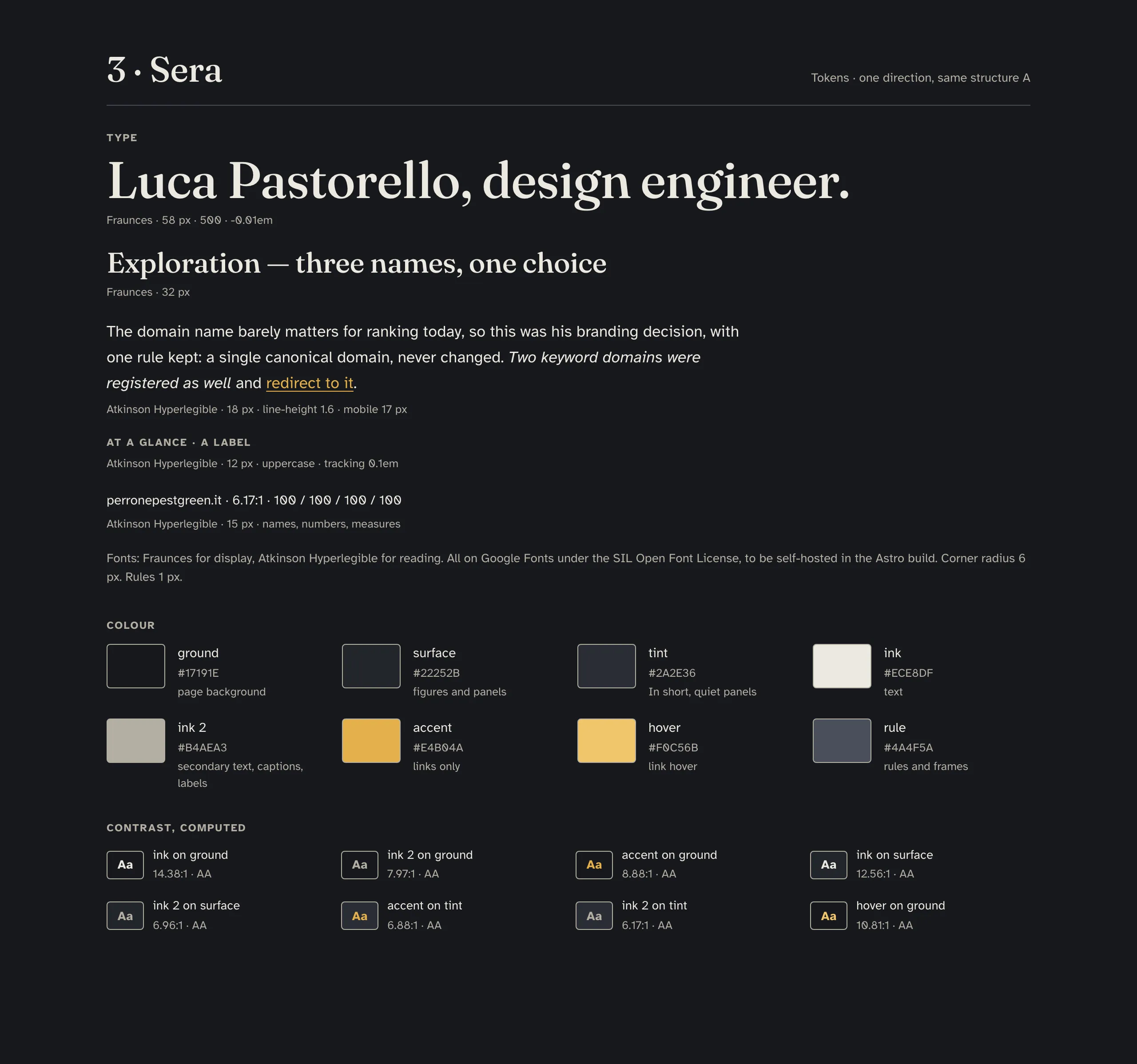
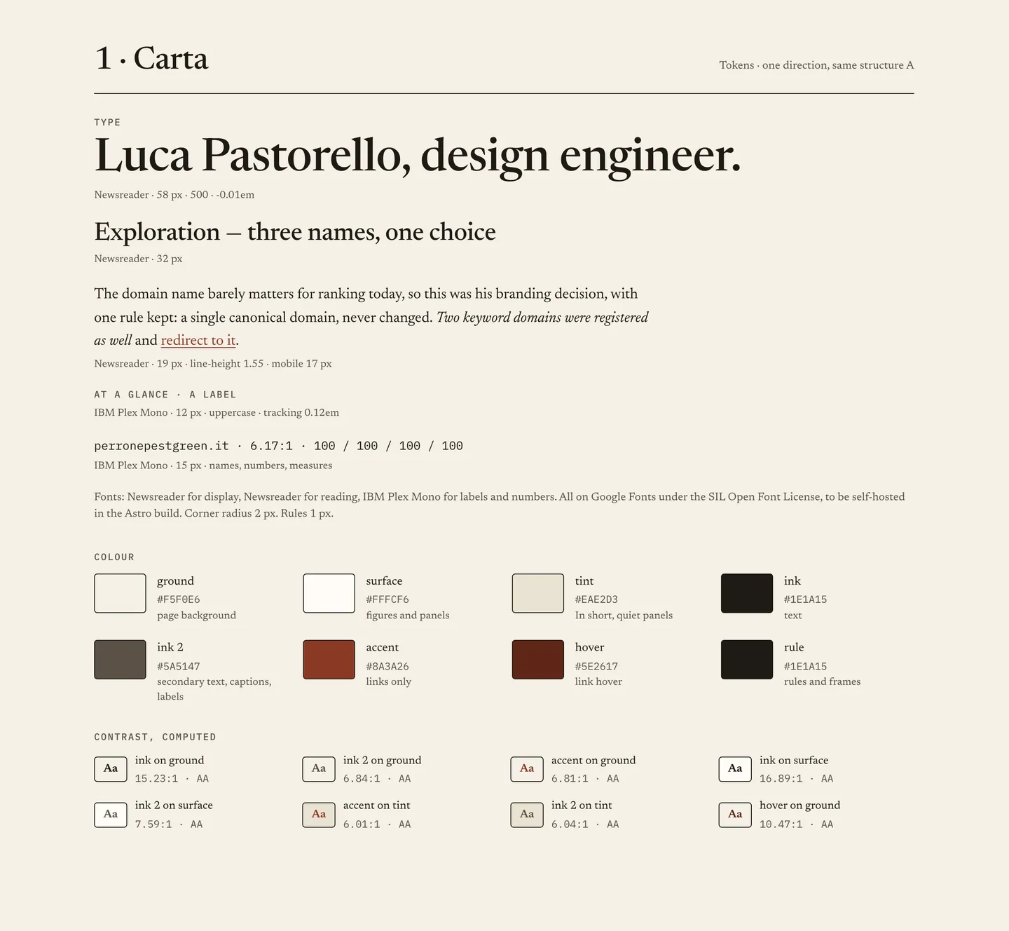


I chose Sera: on a dark ground the light artefacts of the work, screenshots and tables, are the brightest thing on the page, and the eye goes there.
hifi/ · decision.md Solution
Every card has the same shape, and the conclusion comes first. Then the story, in six parts that never change their order, Context, Problem, Exploration, Solution, Build, Result, for the reader with five minutes, who never has to open anything to get there. The repetition is the point: by the second card, a reader knows where to look.


Build
The site is static: Astro turns Markdown into pages, on my machine and in CI, and FTP carries the files to the host. The tokens of the hi-fi canvas are the tokens of the build: one file, copied verbatim, and a script that fails the build on a stray colour or size. Every push runs the gates: format, types, the build, the tokens, the links, axe at zero violations on every page at 390 and 1280, and the server’s rules on a real Apache, with every module and with only the three the host documents.
What the AI did
- Built the site from the specification, one pull request per step: the scaffold, the home, the model card, the other four, the deploy, the QA rounds (24 September – 13 October 2026).
- Wrote the gates, and saw each new check fail before the change it guards: axe on every page, the token audit, the placeholder ledger, the links.
- Found, on probe builds, three Astro defaults that broke a rule: a link glued to its words, colours written inline by the code highlighter, small stylesheets inlined (24 September 2026).
- Ran the server’s rules on Apache with only the host’s three modules, and caught a directive that would have answered 500 on every page (25 September 2026).
What I decided
- The portrait loads lazily, against the specification: eager, it cost about 200 ms on a simulated phone, for a photo at the bottom of the home (24 September 2026).
- The stack logos keep their colours, against a critique that wanted them grey (24 September 2026).
- LinkedIn in the bar on a phone too, where a recruiter looks for it (13 October 2026).
- One script, for the Contents mark, and one page transition, a card’s title moving into place (13 October 2026).
Measured: lowest text pair 6.17:1 · five font files, Latin only · no third-party request · two inline scripts
Result
Where it stands on 13 October 2026, measured on the build, before the first upload. No page sets a cookie or asks another server for anything. The brief’s own measure is still to come.
| Measure | Target | Measured |
|---|---|---|
| Performance at 360 | ≥ 95 | 99–100 |
| Performance at 1280 | ≥ 95 | 100 |
| Accessibility | ≥ 95 | 100 |
| Best practices | ≥ 95 | 100 |
| SEO | ≥ 95 | 100 |
| axe violations at 390 and 1280 | 0 | 0 |
| LCP on mobile | — | 1.36–2.26 s |
| CLS | — | 0 |
| blocking time | — | 0 ms |
docs/qa/lighthouse-2026-10-13-pr-r6.md · docs/qa/qa-2026-10-13-pr-r6.md What comes next
the test with three people from the brief, “Find how he worked on perrone and tell me what the key decision was”, within three minutes and without the browser’s find; then a round of fixes